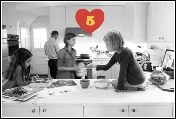
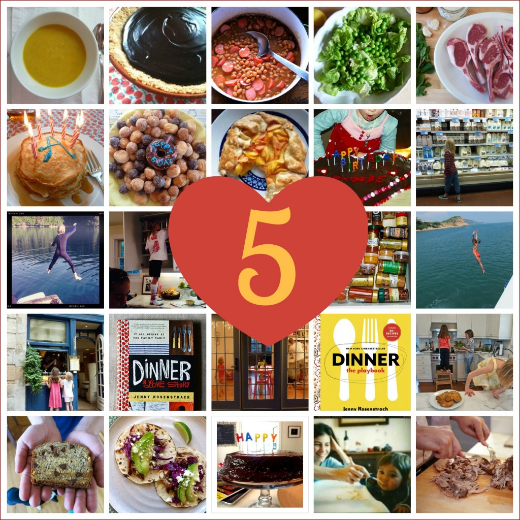
No no no, don’t go anywhere! It’s still Dinner: A Love Story. Still the same blog that brought you Pork Ragu and Pretzel Chicken, the one that taught you phrases like “Deconstructed Dinners” and “Page-Turners;” still the same blog some of you have been checking in with for five years. YES! FIVE YEARS! As of this week, we have officially reached the sapphire anniversary of the day DALS went live with a backlog of posts, including “In Praise of Dansk,” “The Recipe Door,” “Rosa’s Mud Cake,” and “Weaning Them Off the Nugget.” And what better way to celebrate than by doing a little digital renovation? (Well, Mud Cake would probably do the job just fine, too.) The truth is, this mini re-design has been ready to go for a few months now, but I’ve been afraid to pull the trigger on it because…well…because I am clinically sentimental about everything, and it’s hard for me to say goodbye to something voluntarily. Which is, of course, ridiculous, because we’re not really saying goodbye to anything at all. Hopefully, you will find everything you’ve always found here — minus the tiny gray type (I heard from so many of you on this) and plus a few little tweaks (“What to Cook Tonight” moves to the home page, a new page called “Good Reads“) all in a lighter, brighter space. Think of it as the same old DALS house but with some furniture updating and a fresh coat of paint — like maybe I pruned the backyard Elm tree to allow for more light to shine through the windows. Please take a minute to explore the nooks and crannies a bit, if for no other reason than to tell me what you love and what you miss.
Two shout-outs here: First, all re-design credit goes to the gifted and talented Beth Mathews, who I cannot recommend highly enough to anyone out there looking for a designer. Next, to programmer Nick Franciosi, whose Olympic-level patience and efficiency was a godsend to this Olympic level hemmer-and-hawer. Both Nick and Beth hail from Nashville, and based on their talent and niceness alone, I’m thinking of relocating my headquarters down there. Anyway, big thanks to Nick & Beth.
And the rest of you: Let me know what you think!
Back to regularly scheduled dinner-programming this week!

It looks gorgeous! Love your recipes.
The new website looks amazing! As a former editor, a couple of quick thoughts as you search through the inevitable kinks of the new site. (I’ve been through many a launch before!):
(1) The links on the “about” page all like back to the website rather than the Press URLS I imagine should be in place.
(2) On the same page, in your bio, the website page is missing quotation marks around it and your books should be italicized, as per the section immediately above it. (I’m guessing the coding was lost when inserted to the website.)
(3) Is it possible to decrease the size of “comment boxes”? There is a lot of scrolling involved for not much text.
(4) Is it possible to put this comment box at the top of the section so people don’t have to do so much scrolling? (Re: #3)
I hope these help! I look forward to continuing to follow you!
Love the new look but the links in the “about” section dont seem to be working…just fyi..
Overall, looks great! Really clean. I used to have a problem with readability of the old tinted background, so I was happy to see it changed to white, but agree with someone above that black rather than gray type would be even clearer. I read it on my phone, so legibility is key!
I love the new look, it still has the rustic look, yet it looks chic. Don’t know how those designers do it, but well done. My only complaint is that I have to scroll all the way to the bottom to comment, but seriously that is a small complaint (like a person who has to complain about chain emails or something). I love it. Oh, I see you are still making us do addition to comment… hmmm. 🙂 Happy Birthday to the best blog on the Interwebs!
Loved the old look! Love the new look! And the new version loads MUCH faster on my computer (using Safari). You are my FAVORITE blog…. and I don’t even have kids at home. 🙂
Wishing you all the best with your new design. Taking this on can be quite stressful though it all works out. xo Catherine
Very nice!
Love, love, love the new design! There are a few items that I’d tweak, but most notable is the line height. I love the text size, but the serif font runs together for me. I’d increase from 1.5 to 1.7 or 1.8. It just offers a little breathing room in the text.
Ack! I just discovered your blog this week (yay!) and had started at the beginning, working my way through the Archive…is that gone now?
@Rachel – I will have archives back on the home page asap. Stay tuned! In the meantime, my first book (Dinner: A Love Story) would do an excellent job of catching you up as well. 🙂
http://www.amazon.com/exec/obidos/ASIN/0062080903/dialost-20
It looks awesome! Congratulations on 5 years!!
Happy Anniversary! Love it!
I’m a huge fan – but not fond of the new font. Size or type. I think it’s harder to read, IMO.
Congrats on your success and thanks for continuing to help me feed my family.
The blog loads way, way faster.
The typeface would be better bigger….. even more so with the Security Question box.
Great improvement!
Thanks for being consistently interesting.
I have some serious issues reading text that’s in grey. If you could, just make it flat out black, easier to read.
Love the new look! Fresh and fun… as usual, but with a new twist. (e.g. my comment is coming up in italics. I’m finding that inexplicably delightful.) Also, want to mention I’m making pork ragu to take to friends for annual ski trip. This will undoubtedly lock in an invite for next year!
I’m glad you kept the chalkboard logotype. I love that. I love “Olympic level patience”. Classic.
Congratulations! I actually liked the small grey type, I thought it was quite neat. As is the new homepage, a little Bon Appetit-ish. Terribly missing the ability to turn from post to post, having to return every time to the homepage is understandable but a tiny bit annoying – some might only read one or two instead of several posts.
Nicole
I LOVE the redesign! And it totally still feels like the original DALS. You haven’t lost a thing, just gained a happier pair of eyeballs (mine!).
x
I love it. So fresh and crisp. But I’m confused by the comments about the small print – on my computer it looks like the whole site has been enlarged by about 120%. I’m having to zoom out to see all of the first picture, for example. It may be something on my end rather than your end.
Happy blogging anniversary! Love your writing and your recipes.
Love this new look! Looking forward to many, many more great DALS years!
More distinctive now, much improved, but I agree that it would be nice if the new comment box could be above comments. Lots of scrolling!
I love it! Updating isn’t a bad thing..it’s a necessary step. Congrats.
You really, really should have a button that lets a reader go from one blog post to the previous one. Otherwise it’s very annoying to read back through, say, a last week or two week of posts. There should be a “last post” and “next post” button on every blog entry, if that makes sense.
Emily – I’m working on this, don’t worry. It’s happening! Thanks for feedback. -JR